" height="8.016703141288282px" id="rX0gBnmcu" transform="translate(13.617 6.461)" width="7.896242424242452px"/><path d="M 15.516 0 C 24.082 0 31.03 6.957 31.03 15.534 C 31.03 20.115 29.047 24.234 25.893 27.078 C 26.026 26.522 26.085 25.964 26.085 25.415 C 26.085 20.478 21.521 20.478 19.442 20.478 C 17.364 20.478 16.876 20.559 15.328 20.559 C 14.023 20.559 12.76 20.437 12.76 18.805 C 12.76 17.745 13.616 17.01 13.616 17.01 C 13.616 17.01 14.35 17.134 15.41 17.134 C 20.87 17.134 23.337 14.187 23.6 10.362 C 24.201 1.62 6.855 1.448 7.056 10.239 C 7.177 15.582 11.823 16.522 11.823 16.522 C 11.823 16.522 8.685 17.785 8.685 20.846 C 8.666 21.42 8.815 21.988 9.11 22.479 C 9.407 22.972 9.84 23.368 10.355 23.62 C 10.355 23.62 6.36 24.397 5.949 27.761 C 4.094 26.309 2.594 24.453 1.563 22.334 C 0.532 20.215 -0.002 17.89 0 15.534 C 0 6.957 6.947 0 15.516 0 Z" fill="rgb(0, 0, 0)" height="27.761438060606068px" id="X1zw8g7qi" width="31.030314109320187px"/></g></svg>)


Products
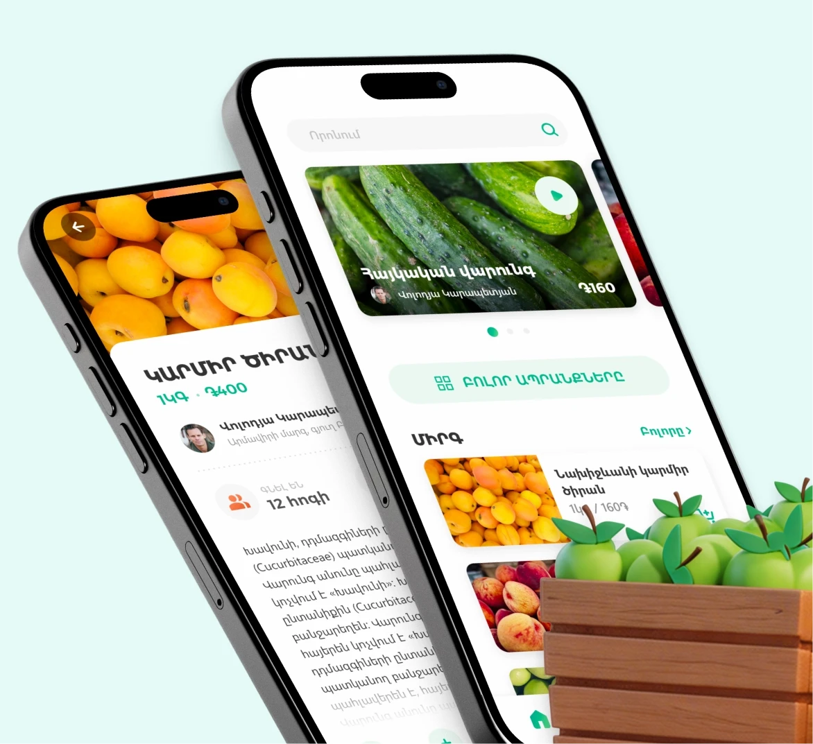
The interface was designed from scratch to handle over a hundred operations, from payments to loan repayments and mobile top-ups. Every screen had to work equally well on a bright day or in a softly lit branch, with hardware that was not originally built for high-resolution visuals.
Interface roles and scenarios
From payment to receipt, each process was mapped to reduce friction and shorten steps.
A clear and tactile system designed for direct interaction, where every motion and sound matters.
The UI’s color system and typography maintain consistent readability in any light. It’s stable, not reactive, ensuring the same experience whether the terminal is inside a branch or under direct sun.
Clarity became the core design rule, every color, line and shadow chosen for maximum stability in real conditions.
The new interface simplified payments, improved transaction speed, and made banking available in any environment, from open-air terminals to indoor branches.
2x
Faster completion of key terminal tasks
100+
35%
Fewer steps to complete common payments