Design Systems

Design Systems

Transforming Armenia’s Leading Bank with a Scalable Design System

Transforming Armenia’s Leading Bank with a Scalable Design System

Ardshinbank is Armenia’s largest financial institution, offering full-service banking for both retail and business customers across the country.

Ardshinbank is Armenia’s largest financial institution, offering full-service banking for both retail and business customers across the country.

Client

Ardshinbank

Deliverables

UX Research

UX Design

UI Design

Design System

Design Tokens

The Challenge

Ardshinbank needed a branded and scalable design system to modernize their website, support future growth, and enable internal teams to build independently

Client

Ardshinbank

Deliverables

UX Research

UX Design

UI Design

Design System

Design Tokens

The Challenge

Ardshinbank needed a branded and scalable design system to modernize their website, support future growth, and enable internal teams to build independently

The system
We Designed

The system
We Designed

The system
We Designed

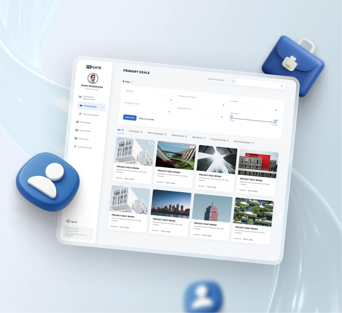
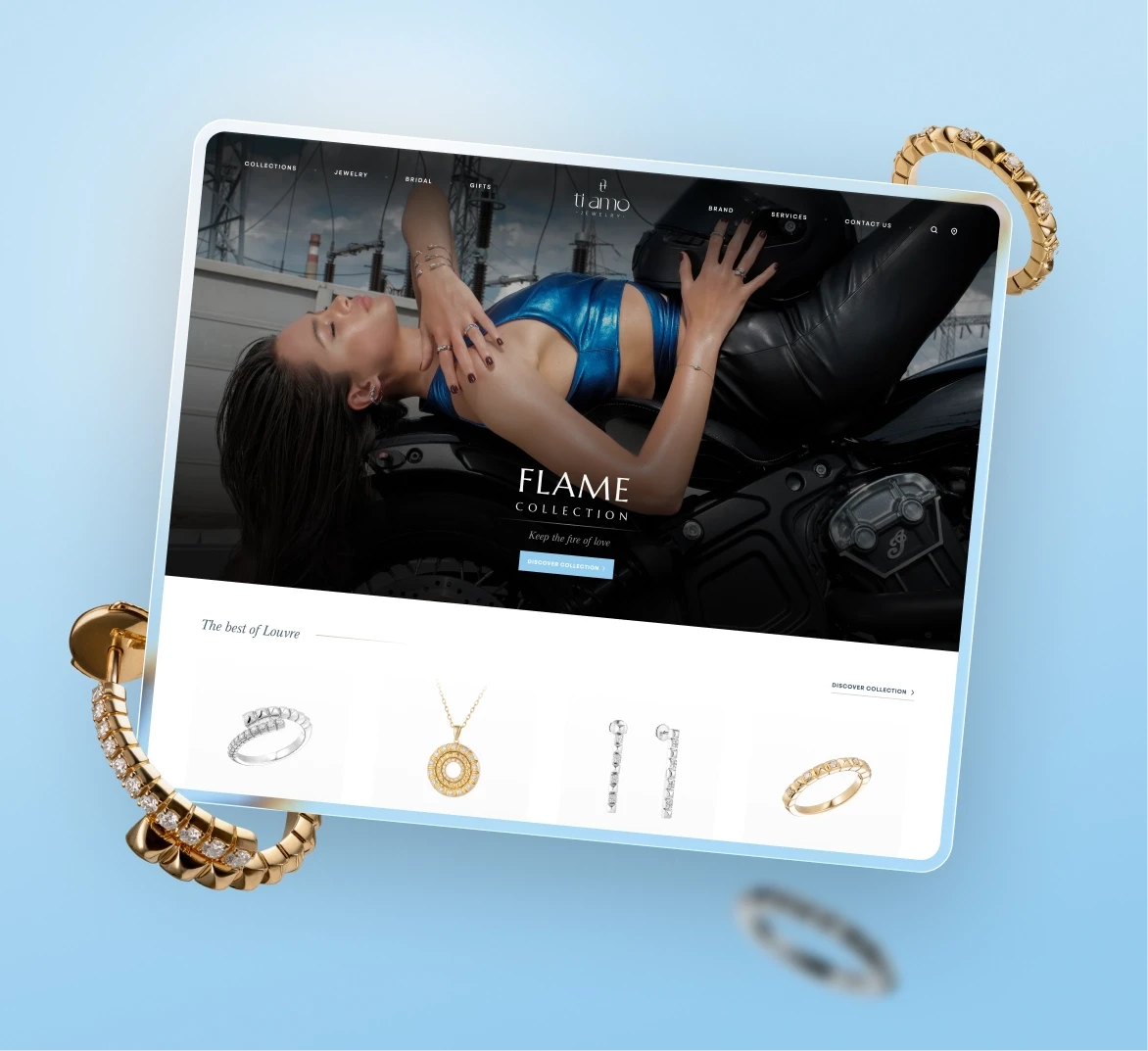
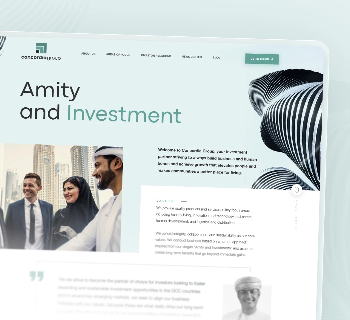
We delivered a responsive design system with reusable components, scalable layouts, and brand-consistent visuals. Every block was carefully crafted to work across five breakpoints, with documented rules for mobile behavior.

Each UI module was tested across desktop and mobile and wrapped into a centralized library. The goal: give the IT team full independence to build future pages from pre-approved pieces.

From research and wireframes to final UI, the process was built around one principle: make it easy to grow.

From research and wireframes to final UI, the process was built around one principle: make it easy to grow.

Architecture and
Component Structure

Architecture and
Component Structure

Architecture and
Component Structure

From navigation to mobile transitions, every part of the system was purpose-built for clarity, reuse, and scale.

  1. Planning & Wireframing

    We started with wireframes for every key block and page type, built after content audits and research.

    01

  2. Planning & Wireframing

    We started with wireframes for every key block and page type, built after content audits and research.

    01

  3. Breakpoint Behavior

    Each module was designed for 5–6 breakpoints, with clear logic for padding, resizing, and layout shifts.

    02

  4. Breakpoint Behavior

    Each module was designed for 5–6 breakpoints, with clear logic for padding, resizing, and layout shifts.

    02

  5. Brand Alignment

    We integrated existing brand guides, then expanded the system to cover motion, color interaction, and accessibility.

    03

  6. Brand Alignment

    We integrated existing brand guides, then expanded the system to cover motion, color interaction, and accessibility.

    03

  7. Component Variants

    Each component included edge cases and optional versions to support long-term flexibility.

    04

  8. Component Variants

    Each component included edge cases and optional versions to support long-term flexibility.

    04

  9. Developer Documentation

    Our handoff included full guides for mobile behavior, typography logic, and responsiveness.

    05

  10. Developer Documentation

    Our handoff included full guides for mobile behavior, typography logic, and responsiveness.

    05

  11. Knowledge Transfer

    We walked the internal IT team through the file and logic, making sure they could own and extend the system.

    06

  12. Knowledge Transfer

    We walked the internal IT team through the file and logic, making sure they could own and extend the system.

    06

Bringing It
all to Life

Bringing It
all to Life

Bringing It
all to Life

Each layout was tested on real content and real breakpoints. We treated mobile as first-class, tested for edge cases, and created layout rules the client could apply on future pages without needing us.

Product Pages

01

Each product page clearly presents account benefits, terms, actions, and calculators. UX choices help users understand offerings quickly.

Product Pages

01

Each product page clearly presents account benefits, terms, actions, and calculators. UX choices help users understand offerings quickly.

Motion Highlights

01

We designed a smooth logo intro using animated lines and kept that visual style consistent across key screens and interface animations.

Motion Highlights

01

We designed a smooth logo intro using animated lines and kept that visual style consistent across key screens and interface animations.

Business Banking Pages

01

We created structured pages for SMEs and large businesses with custom flows for guarantees, POS, salary projects, and more

Business Banking Pages

01

We created structured pages for SMEs and large businesses with custom flows for guarantees, POS, salary projects, and more

Design System Components

01

We built a modular design system focused on saving time when creating new pages and modules. We applied it across more than 100 pages based on these components.

Design System Components

01

We built a modular design system focused on saving time when creating new pages and modules. We applied it across more than 100 pages based on these components.

Designing for
Ownership and Reuse

Designing for
Ownership and Reuse

Designing for
Ownership and Reuse

This wasn’t a portfolio piece - it was infrastructure. Our job was to make their new design system easy to expand, flexible to apply, and hard to break. We worked with their internal team directly, sprint by sprint, until every element was locked in.

This system wasn’t built for presentation. It was built for production.

Results
After Launch

Results
After Launch

Results
After Launch

The new design system gave Ardshinbank a unified visual language, reduced design overhead, and enabled fast internal production.

45%

Less UI clarification during development

100+

Pages built using the shared design system

2x

Faster page creation using reusable components

Let’s talk about your

digital challenges.

Good work happens when the right teams meet. We’re ready when you are.

Book a call

Let’s talk about your

digital challenges.

Good work happens when the right teams meet. We’re ready when you are.

Book a call

Let’s talk about your

digital challenges.

Good work happens when the right teams meet. We’re ready when you are.

Book a call

Let’s talk about your

digital challenges.

Good work happens when the right teams meet. We’re ready when you are.

Book a call

Let’s talk about your

digital challenges.

Good work happens when the right teams meet. We’re ready when you are.

Book a call

Other Cases

Other Cases

Other Cases