" height="8.016703141288282px" id="rX0gBnmcu" transform="translate(13.617 6.461)" width="7.896242424242452px"/><path d="M 15.516 0 C 24.082 0 31.03 6.957 31.03 15.534 C 31.03 20.115 29.047 24.234 25.893 27.078 C 26.026 26.522 26.085 25.964 26.085 25.415 C 26.085 20.478 21.521 20.478 19.442 20.478 C 17.364 20.478 16.876 20.559 15.328 20.559 C 14.023 20.559 12.76 20.437 12.76 18.805 C 12.76 17.745 13.616 17.01 13.616 17.01 C 13.616 17.01 14.35 17.134 15.41 17.134 C 20.87 17.134 23.337 14.187 23.6 10.362 C 24.201 1.62 6.855 1.448 7.056 10.239 C 7.177 15.582 11.823 16.522 11.823 16.522 C 11.823 16.522 8.685 17.785 8.685 20.846 C 8.666 21.42 8.815 21.988 9.11 22.479 C 9.407 22.972 9.84 23.368 10.355 23.62 C 10.355 23.62 6.36 24.397 5.949 27.761 C 4.094 26.309 2.594 24.453 1.563 22.334 C 0.532 20.215 -0.002 17.89 0 15.534 C 0 6.957 6.947 0 15.516 0 Z" fill="rgb(0, 0, 0)" height="27.761438060606068px" id="X1zw8g7qi" width="31.030314109320187px"/></g></svg>)


Products
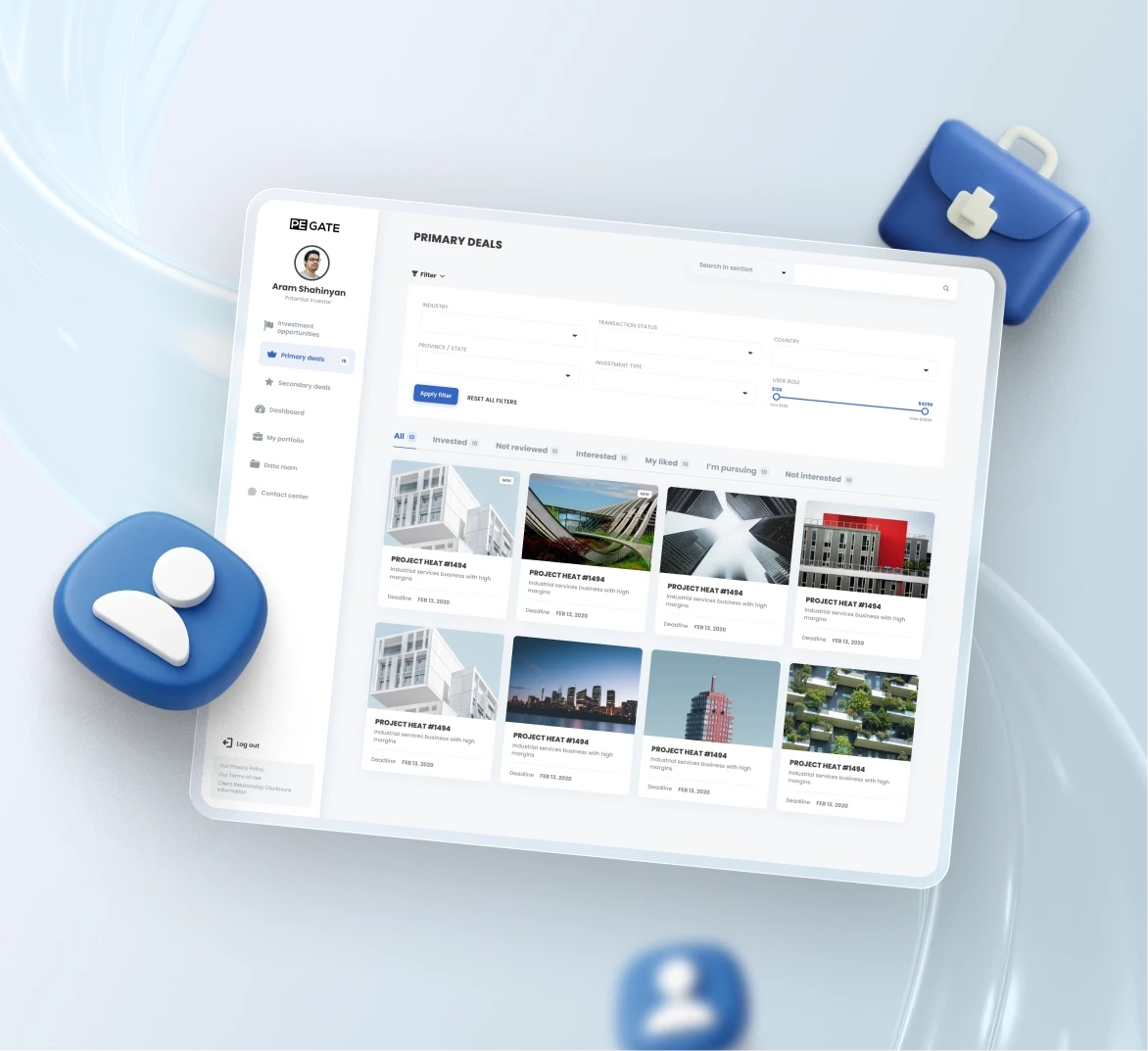
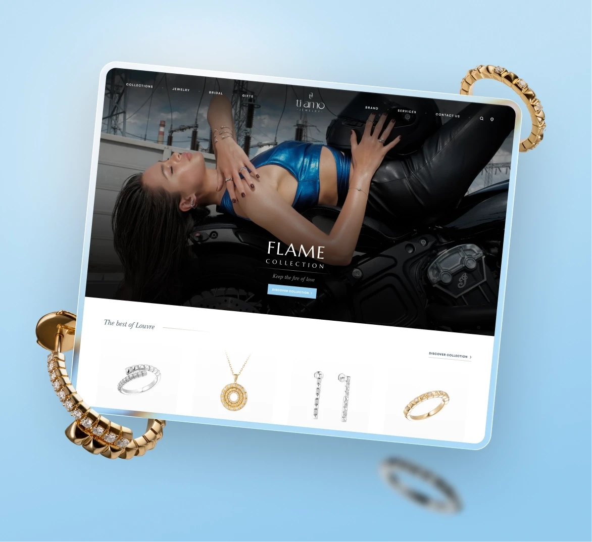
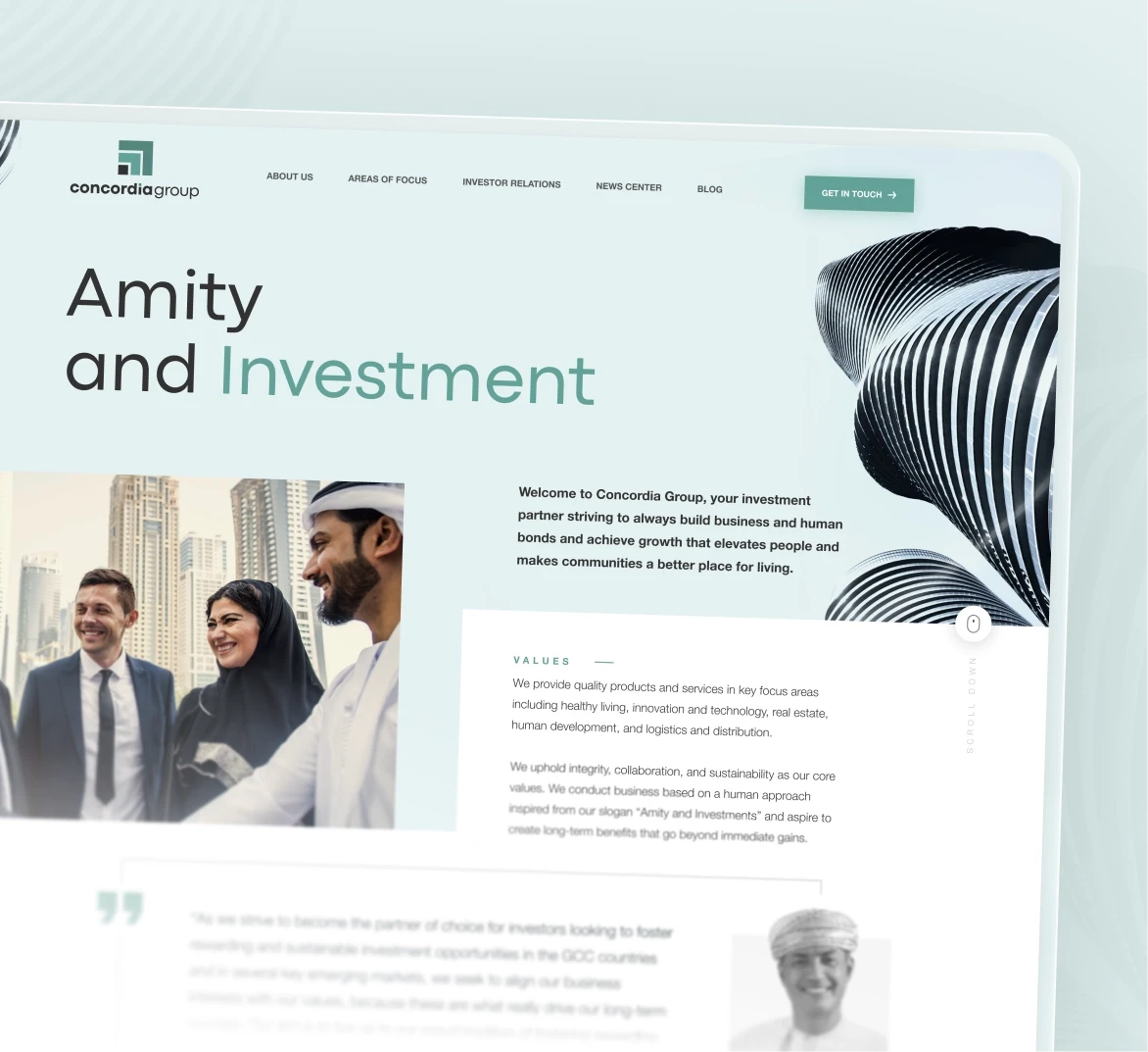
What started as a website refresh became a much bigger task. The ecosystem needed one readable structure, one consistent experience, and one visual language strong enough to connect very different services under the same brand.
From scattered touchpoints to one readable system
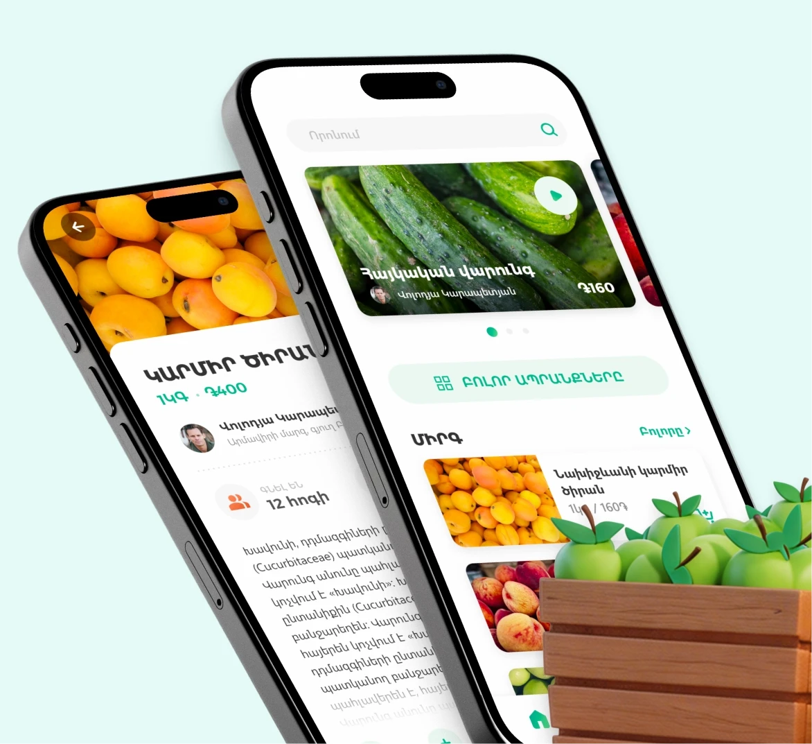
The interface was shaped to feel fresh and expressive, but still practical at scale. Visual storytelling had to support orientation, not compete with it.
A clearer structure replaced fragmentation. Products, content, and service flows now sit inside one system, so new features fit without friction. Navigation is simpler, modules are reusable, and the 3D language ties everything together. The experience feels wider, but easier to grasp.
The site now reflects a connected ecosystem, with products and services aligned around a core brand.
The new platform unified content, products, and navigation into one clear digital experience.
10+
Products unified under one ecosystem structure
3x
40%
Reduced time to reach key actions and content